Case study · Website and product design

Fite Market.

A peer-to-peer crypto exchange for combat sports — match with another fan, lock into escrow, settle on-chain the second the bell rings.

Earn. Bet. Dominate.

Match with another fan, lock into escrow, settle on-chain the second the bell rings. Built like a fight, not a fintech app.

The brief, in short

Project details.

Objectives

  • Launch a peer-to-peer betting exchange that reads as high-stakes, not another DeFi dashboard
  • Make escrow and settlement feel transparent and fast, not opaque
  • Prove it's a real product with an actual staking flow, not a marketing illustration

Key Services

  • Website design & build
  • Product / UI design for the trading and escrow flow
  • Brand identity — coin mark, colour system, motion

Stack

  • Next.js + React
  • Tailwind CSS
  • Framer Motion
  • Vercel

The look

Built like a fight, not a fintech app.

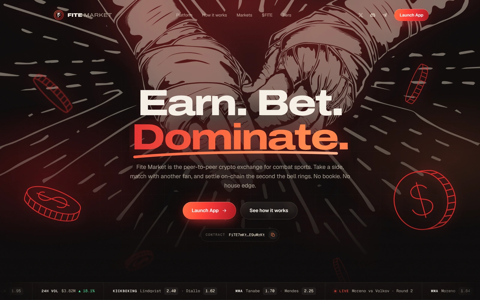
Fite Market leans all the way into its subject: a near-black canvas, a bull rendered in glowing red wireframe, and a wordmark built around a boxing-ring coin mark. Nothing about it reads as a generic DeFi dashboard — it reads as a betting slip you'd actually want to hold.

The interface earns its swagger with real specificity: circular gauge stats instead of plain numbers, a live betting-ticket UI showing an actual escrow flow, and a torn-ticket motif running through the odds cards. It's confident because the details are considered, not just because the copy says “Dominate.”
The palette

  • Ring black#0B0505
  • Fight red#FF3B30
  • Corner orange#FF7A45
  • Blood red#B0121B

A closer look

Inside the product.

Earn, bet, dominate — on every screen.

01 / 03
fite.market
Fite Market's hero: the Earn. Bet. Dominate. headline over a glowing wireframe fist bump
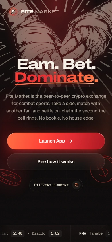
The same hero on mobile, with the live odds ticker along the bottom
fite.market
Fite Market's hero: the Earn. Bet. Dominate. headline over a glowing wireframe fist bump
The same hero on mobile, with the live odds ticker along the bottom

Three choices that carry the whole page

What makes it work.

  1. CHOICE 01

    A coin-mark built for the ring

    The circular brand mark reads as a boxing ring from one angle and a coin from another — exactly the two things this product actually is.

  2. CHOICE 02

    Stats as gauges, not just numbers

    House edge, settlement time, volume and active traders are shown as glowing dial gauges instead of plain stat blocks, reinforcing the “built for scale” pitch without adding a word of copy.

  3. CHOICE 03

    A real escrow ticket, not a mockup

    The Main Event card shows an actual staking flow — odds, stake, payout, escrow status — closer to a working product screen than a marketing illustration.

The process behind the page, start to finish

How we got there.

  1. 01

    Retained.

    Fite Market brought us on to take a peer-to-peer betting concept and make it feel built for scale, not a weekend project.

  2. 02

    Meetings.

    A handful of calls to understand the escrow flow and how odds, stakes and settlement actually needed to read on screen.

  3. 03

    Concept.

    The coin-mark wordmark and wireframe bull came out of this stage — a ring and a coin, the two things this product actually is.

  4. 04

    Architecture.

    Betting, books and stats, one connected story. We mapped the page around fight night, not a feature list.

  5. 05

    Wireframes.

    Low-fidelity layouts to test the pacing — hero, live books, stats — before any of the final visual language was applied.

  6. 06

    Finished build.

    A near-black canvas, glowing dial gauges and a real escrow ticket that reads like a working product, not a mockup.

Your move

Want a product that looks like it means it?