



Objectives
- Launch a private-beta landing page that turns curiosity into requested access
- Make six separate tools read as one connected platform, not a feature dump
- Prove it's a real product with actual UI, not illustrated mockups
Case study · Website and product design
AI-powered curation software, powered for the modern playlisting ecosystem.
Get loud.
The modern playlisting ecosystem is disjointed. Have no fear — Super Curator is here to save playlisters using platforms like Spotify, YouTube, Deezer, Apple Music, and more.
The brief, in short
The look
Gone are the days of having to manage submissions across multiple platforms and sites. Now, playlisters can use Super Curator’s AI-powered tools to supercharge their workflow.
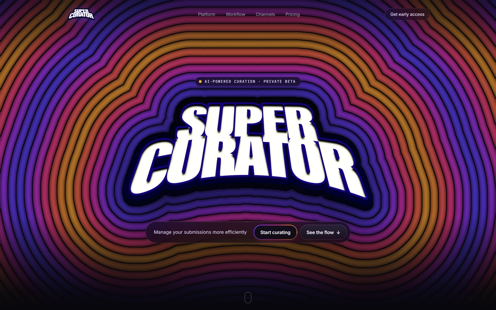
The site demands your attention and then draws you in to learn more. Dark panels, tight type, and real product screens show you the actual workflow (including things like your inbox, pending deadlines, playlist metrics, and more). The flash gets your attention. The considered UI makes your streamlined workflow more intuitive.
The palette
A closer look
The same neon curation dashboard, on every screen.
Three choices that carry the whole page
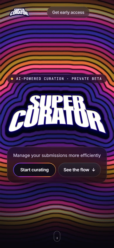
Most SaaS logos disappear into the nav. This one is the hero — a hand-built, slightly distorted comic-lettering treatment that reads as confident rather than corporate before a single word of copy loads.
Intake, versioning, taste model, batch editing, distribution and the signal loop could easily read as six separate features. Numbering them 01–06 against one connecting narrative keeps it feeling like a single machine, not a feature dump.
The inbox, version-branching and distribution panels shown mid-page are close enough to an actual product screen to feel earned rather than illustrated — exactly what a tool for people with taste needs to look like.
The process behind the page, start to finish
Super Curator brought us on to take the private beta from idea to a site that could actually convince curators to request access.
A handful of calls to get the six tools, the taste model and the voice right before any pixels moved.
The comic-lettering wordmark and concentric-ring hero came out of this stage — the loud, confident register the rest of the page had to live up to.
Six separate tools, one connected story. We mapped the page around a single flow instead of a feature list.
Low-fidelity layouts to test the pacing — loud hero, quiet workflow — before any of the final visual language was applied.
Dark panels, real product screens, and a hero animation that doesn’t quit the moment it loads.
Pick your favorite agent — we'll open it with a question about what we do, who we're a good fit for, and how pricing works.