
Astutica.
Property management software that would rather feel like a well-run building than a dashboard.

Software that says “welcome” first.
A calm register for an unglamorous category.
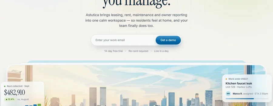
Property management tools default to dense and utilitarian — Astutica opens instead with an oversized script “Welcome,” a pastel sky-to-sage gradient, and serif type more at home on a boutique hotel site than a SaaS dashboard. It’s an unusual first impression for the category, and a memorable one.
That warmth doesn’t disappear once the product shows up. Leasing pipelines, rent ledgers and maintenance tickets are all still there, but they sit in soft cards with generous white space rather than the grey grid most competitors ship. It reads like software built by people who’ve actually managed buildings.
The palette
What makes it work.
Three choices that carry the whole page.
A serif where everyone else uses grotesk
Instrument Serif on the headline, paired with a hand-drawn “Welcome” script, separates this from the sea of sans-serif property-management dashboards — it borrows real-estate and hospitality cues instead of generic SaaS ones.
Six workspaces, one calm thread
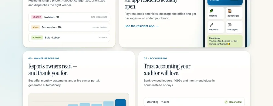
Leasing, rent, maintenance, resident experience, owner reporting and accounting each get their own numbered section with its own small product panel, so a genuinely complex back office reads as six short stories instead of one dense feature matrix.
Proof before the pitch
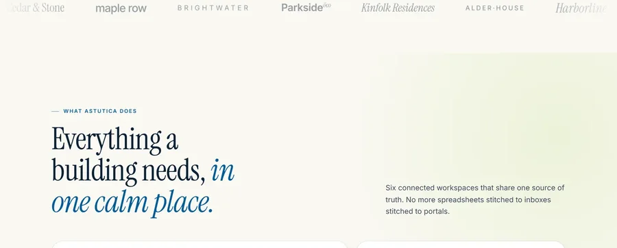
A live-looking rent-collected ticker and a wall of client logos sit right under the fold, doing the trust-building work before the visitor has scrolled past the first screen.
A closer look.
A few more frames from the page.