




Case study · Website and branding

Pretty Dark Places.

A memoir and coaching brand for author Chrystal Lee, designed to feel personal even at a browser’s arm’s length.

Dark, but never cold.

A near-black page and a hot-pink accent could read as edgy for its own sake. With a warm author photo and a wall of real reader reviews, it reads as intimate instead.

The brief, in short

Project details.

Objectives

  • Launch a memoir and coaching site that feels intimate, not edgy for its own sake
  • Let a wall of real reader reviews do the work of proving the book resonates
  • Keep buying the book and booking a coaching call as two distinct, unhurried decisions
Key Services

  • Website design & build
  • Brand & content direction — palette, photography direction, copy
  • Coaching booking integration

Stack

  • Webflow
  • Photoshop
  • CSS
  • JavaScript

The look

Dark, but never cold.

A near-black background and a hot-pink accent could easily read as edgy for its own sake, but paired with a warm author photo, a handwritten-feeling script logo, and a full wall of real reader reviews, the effect is intimate rather than harsh.

The page does one thing at a time: sell the book, introduce the author, prove the book resonates, then offer coaching — each with its own section and its own breathing room, rather than cramming a bio, a shop and a booking form onto one crowded screen.

The palette

  • Pretty Dark pink#D4387A
  • Near-black#141213
  • Panel charcoal#1C1A1B
  • Warm blush text#F5E6EE

A closer look

Inside the site.

The book, with the same presence, on every screen.

01 / 03
prettydarkplaces.com
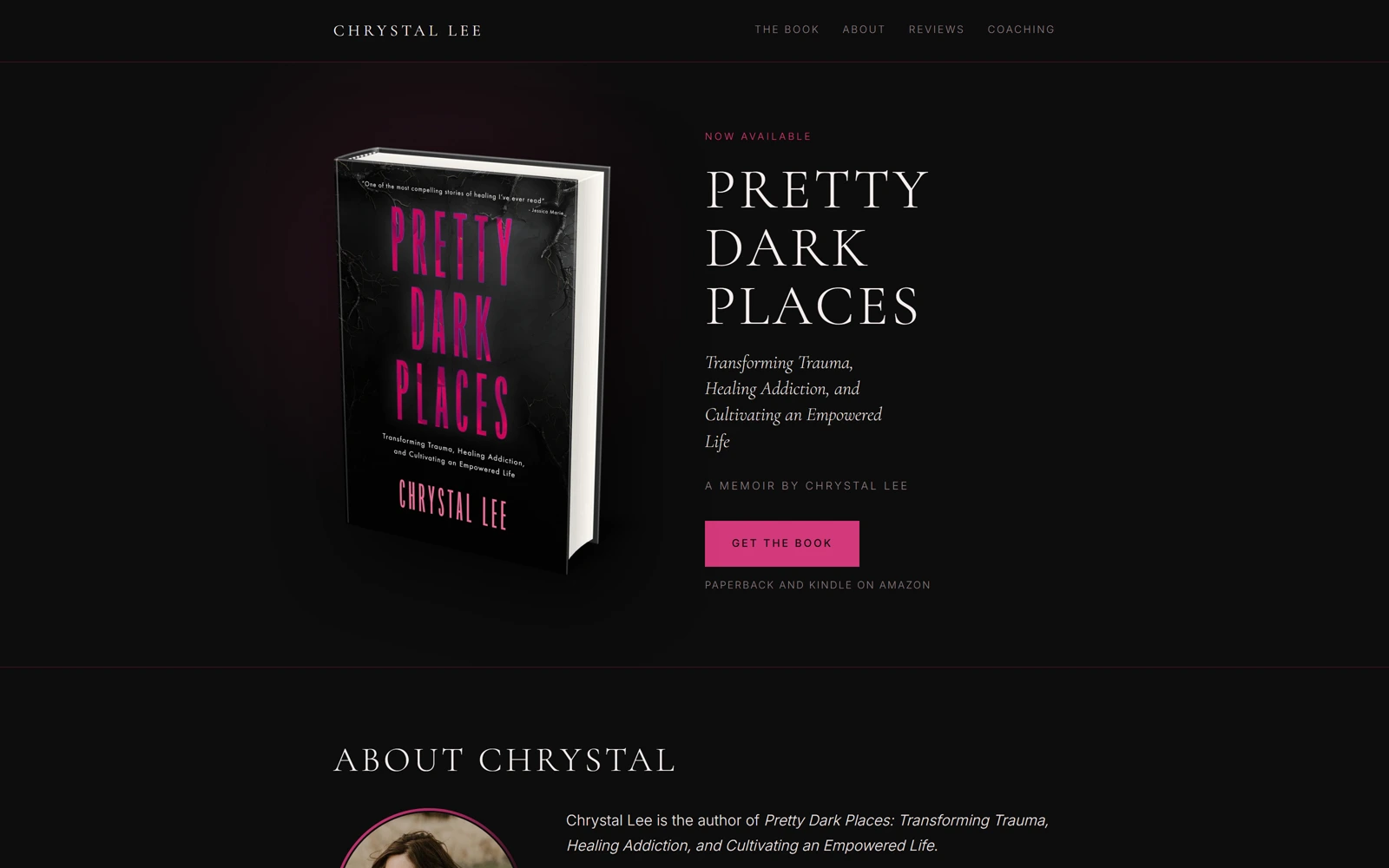
Pretty Dark Places' hero: the 3D book mockup beside the title and Get the Book button
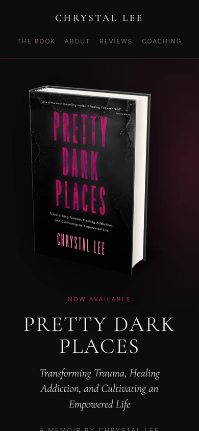
The same hero on mobile, book mockup stacked above the title
prettydarkplaces.com
Pretty Dark Places' hero: the 3D book mockup beside the title and Get the Book button
The same hero on mobile, book mockup stacked above the title

Three choices that carry the whole page

What makes it work.

  1. CHOICE 01

    A real testimonial wall, not three quotes

    Nine full reader reviews, star ratings included, sit in their own grid — a memoir lives or dies on whether it resonated, and the page lets a lot of real readers make that case at once.

  2. CHOICE 02

    The book is a 3D object, not a flat cover

    A rendered, slightly angled book mockup gives the cover physical presence, the way a bookstore table does, instead of a flat JPEG.

  3. CHOICE 03

    Two distinct calls to action

    Buy-the-book and book-a-coaching-call are kept as two distinct sections, so a reader isn’t accidentally funnelled into booking a session before they’ve even read the book.

The process behind the page, start to finish

How we got there.

  1. 01

    Retained.

    Chrystal Lee brought us on to give her memoir and coaching practice a site that felt personal, even at a browser’s arm’s length.

  2. 02

    Meetings.

    A few calls to understand the book, the reader reviews, and how buying and coaching needed to stay separate asks.

  3. 03

    Concept.

    The near-black background and hot-pink accent came out of this stage — dark enough to feel honest, warm enough to stay intimate.

  4. 04

    Architecture.

    Sell the book, introduce the author, prove it resonates, then offer coaching — one section at a time, not one crowded screen.

  5. 05

    Wireframes.

    Low-fidelity layouts to test the pacing — book, author, reviews, coaching — before any of the final visual language was applied.

  6. 06

    Finished build.

    A 3D book mockup, a full wall of real reviews, and two distinct calls to action that never funnel a reader by accident.

Your move

Want a personal brand with this much warmth?