Case study · Website and product design

Forsiche.

Case management software for forensic teams — evidence, custody and courtroom-ready reporting in one record.

Every contact leaves a trace.

Case management for forensic teams. Evidence, custody and courtroom-ready reporting in one record, built for people who get cross-examined on their software.

The brief, in short

Project details.

Objectives

  • Launch a case-management platform that reads as courtroom-credible, not generic SaaS
  • Make chain-of-custody and AI-assisted analysis feel trustworthy, not like a black box
  • Prove it's a real product with actual screens, not illustrated mockups

Key Services

  • Website design & build
  • Product / UI design for the case-management dashboard
  • Brand identity — fingerprint mark, colour system, motion

Stack

  • Next.js + React
  • Tailwind CSS
  • Framer Motion
  • Vercel

The look

Evidence, treated like evidence.

Forsiche trades typical SaaS brightness for something closer to a case file — near-black panels, monospace timestamps and hash strings, and a fingerprint motif that runs from the hero straight through to the link-analysis board. It reads less like software marketing and more like the record itself.

The one loud gesture is reserved for the accent: a narrow band of mint-teal that marks anything live — matches, signatures, active links — against a field that's otherwise deliberately quiet. Restraint is the point; this is a tool built for people who get cross-examined on their software.
The palette

  • Case black#05070A
  • Deep evidence green#0B1F1B
  • Signal mint#6FF3D4
  • Alert red#FF4D5E

A closer look

Inside the product.

Every contact leaves a trace — on every screen.

01 / 03
forsiche.io
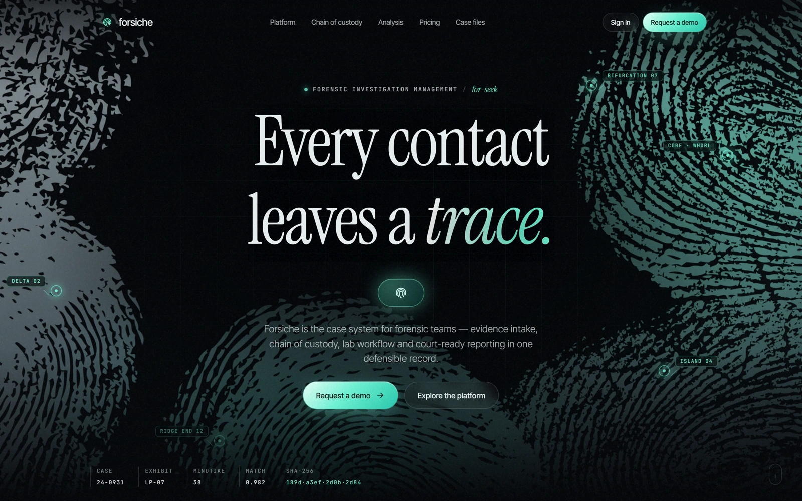
Forsiche's hero: the Every contact leaves a trace headline over a glowing fingerprint motif
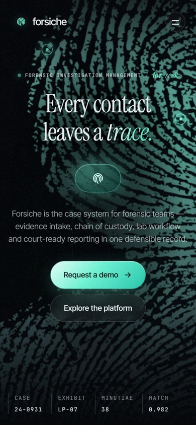
The same hero on mobile, with the case-file stat strip along the bottom
forsiche.io
Forsiche's hero: the Every contact leaves a trace headline over a glowing fingerprint motif
The same hero on mobile, with the case-file stat strip along the bottom

Three choices that carry the whole page

What makes it work.

  1. CHOICE 01

    A fingerprint that means something

    The ridge-and-whorl mark isn't decoration — it's the same motif used for the case-board link analysis and the wireframe behind assisted analysis, so the brand and the product argument are the same image.

  2. CHOICE 02

    Every hand-off, hash-chained

    The custody timeline turns an abstract compliance promise — nothing goes missing — into six plain steps with real hash fragments attached, a much easier thing to trust than a paragraph of copy.

  3. CHOICE 03

    AI that shows its work

    Assisted analysis is framed as ranked, sourced suggestions with a visible score, not a black box — the exact posture a tool needs when its output might end up in front of a jury.

The process behind the page, start to finish

How we got there.

  1. 01

    Retained.

    Forsiche brought us on to take a case-management concept and make it feel like software investigators could actually trust in court.

  2. 02

    Meetings.

    A handful of calls to understand chain-of-custody requirements and how examiners actually want AI assistance to show its work.

  3. 03

    Concept.

    The fingerprint motif and near-black register came out of this stage — a deliberate departure from typical SaaS brightness.

  4. 04

    Architecture.

    Evidence, custody and analysis, one connected record. We mapped the page around a single case file, not a feature list.

  5. 05

    Wireframes.

    Low-fidelity layouts to test the pacing — case board, custody timeline, assisted analysis — before the final visual language was applied.

  6. 06

    Finished build.

    Near-black panels, monospace timestamps and a hash-chained custody trail that reads like the record itself.

Your move

Want a site that looks and feels like this?