







Case study · Website and product design

Bet MMA.

Live sportsbook odds for MMA, compared side by side in the time it takes to glance.

One number pops.

Betting-odds products live or die on trust in the numbers. Only the best price gets colour, so the number that matters is the one you see.

The brief, in short

Project details.

Objectives

  • Launch an odds-comparison product that reads as trustworthy at a glance, not flashy
  • Make the single best price across dozens of books and markets findable in seconds
  • Keep a dense, live-updating table usable one-handed on a phone during fight week
Key Services

  • Website design & build
  • Product / UI design for the odds board and comparison tables
  • Brand identity — wordmark, colour system, motion

Stack

  • Next.js + React
  • Tailwind CSS
  • Framer Motion
  • Vercel

The look

Precision dressed as simplicity.

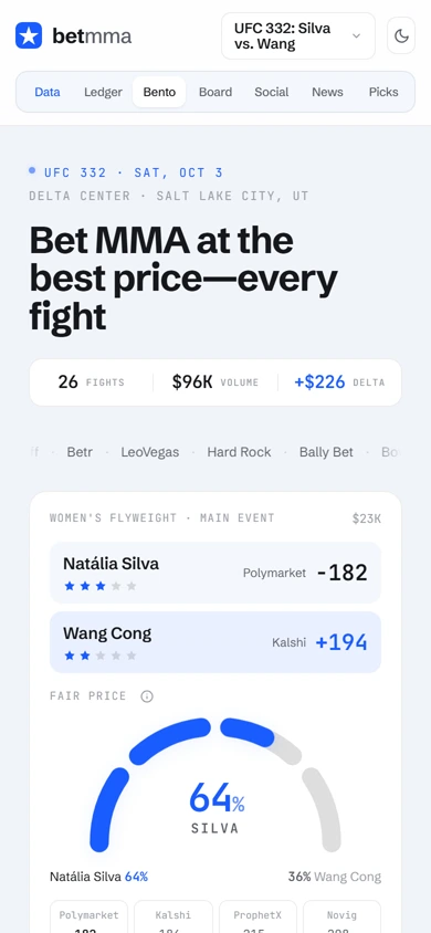
Betting-odds products live or die on trust in the numbers, so Bet MMA’s design mostly gets out of the way: white space, a tight blue accent, and tables that align numbers instead of decorating them. It’s built to be scannable at a glance, mid fight-week, on a phone.

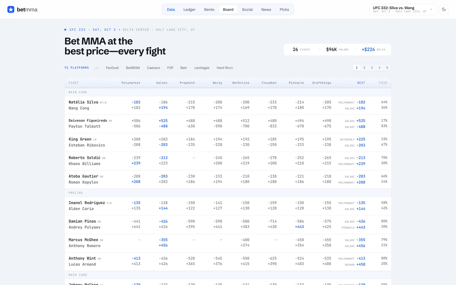
The one flourish is restraint: the best price is called out once per row in blue, and everything else — logos, spreads, percentages — sits in a quiet grey scale, so the one number that actually matters is the one that pops.

The palette

  • Bet MMA blue#1A5CFF
  • Deep navy#0B1F4D
  • Clean white#FFFFFF
  • Table grey#F4F6FB

A closer look

Inside the product.

The best price, on every screen.

01 / 03
betmma.io
Bet MMA's live odds board, comparing prices across dozens of sportsbooks for a fight card
The same best-price comparison reflowed into stat cards on mobile
betmma.io
Bet MMA's live odds board, comparing prices across dozens of sportsbooks for a fight card
The same best-price comparison reflowed into stat cards on mobile

Three choices that carry the whole page

What makes it work.

  1. CHOICE 01

    Best price does the talking

    Every book’s line is shown in the same row, but only the best price gets colour — a small convention that turns a dense odds table into something scannable in two seconds.

  2. CHOICE 02

    A comparison table that respects the sport

    Fight cards, not generic “events,” structure the whole page — main card, prelims, and fighter names given as much visual weight as the numbers beside them.

  3. CHOICE 03

    A responsible-gambling notice, not buried

    The 18+ and self-exclusion notice sits in its own visible card on the homepage rather than a footer afterthought — a small choice that says something about how the product is meant to be used.

The process behind the page, start to finish

How we got there.

  1. 01

    Retained.

    Bet MMA brought us on to take a crowded field of odds-comparison dashboards and build the one bettors actually trust.

  2. 02

    Meetings.

    A handful of calls to understand how serious bettors actually scan a line across dozens of books and markets.

  3. 03

    Concept.

    The restrained blue-on-white register came out of this stage — a deliberate step away from the noisy sportsbook-dashboard norm.

  4. 04

    Architecture.

    Dozens of books, one row per fight. We mapped the page around the comparison itself, not a per-book feature list.

  5. 05

    Wireframes.

    Low-fidelity layouts to test the pacing — headline stats, full board, responsible-gambling notice — before the final visual language was applied.

  6. 06

    Finished build.

    White space, a tight blue accent, and a table that gets out of the way so the best price is the one thing that pops.

Your move

Want a data product this legible?