Case study · Website

John Clark Books.

Four plain-English crypto guides, sold like a real book series instead of an ebook funnel.

Plain English over hype.

Most “buy my ebook” pages are one long scroll of urgency. This one behaves like a small publisher — four books, a box set, and excerpts to read before you buy.

The site

The brief, in short

Project details.

Objectives

  • Launch a book-sales page that reads like a small publisher’s site, not an ebook funnel
  • Make four related crypto guides feel like a real series, each with its own identity
  • Put real reader reviews and a bundle offer ahead of any “buy now” urgency

Key Services

  • Website design & build
  • Product page design for the four-book series
  • Brand identity — per-title colour system, typography, motion

Stack

  • Next.js + React
  • Tailwind CSS
  • Framer Motion
  • Vercel

The look

A bookstore, not a squeeze page.

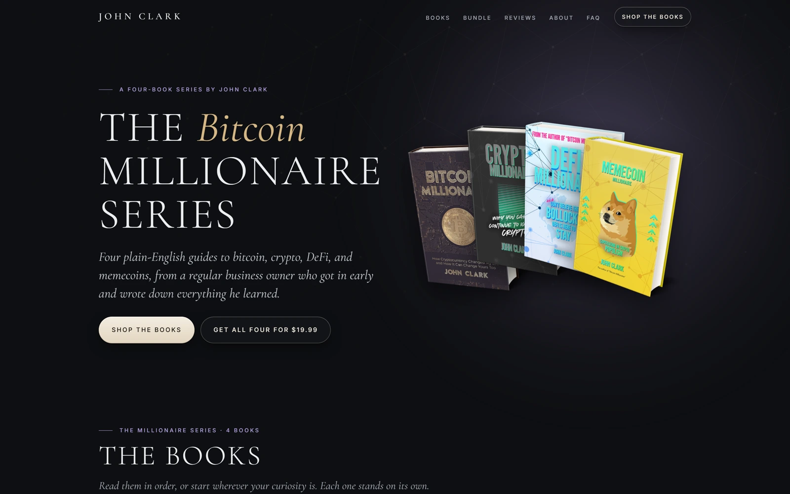
Most “buy my ebook” pages are one long scroll of urgency. This one behaves like a small publisher’s site instead: four books shown as objects with their own spine colour and price, a bundle offer that reads like a box set, and full excerpts further down for anyone who wants to read before they buy.

The dark, warm background and serif-leaning headlines borrow more from a personal-finance imprint than a crypto-hype landing page — a deliberate choice for a series whose whole pitch is plain English over hype.


The palette

  • Ink black#0E0F12
  • Soft lavender#B7A3E6
  • Memecoin gold#C9A24A
  • Crypto green#3A6B52

A closer look

Inside the series.

The complete series, up close.

01 / 03
johnclarkcrypto.com
The Millionaire Series hero: four book covers each with their own spine colour
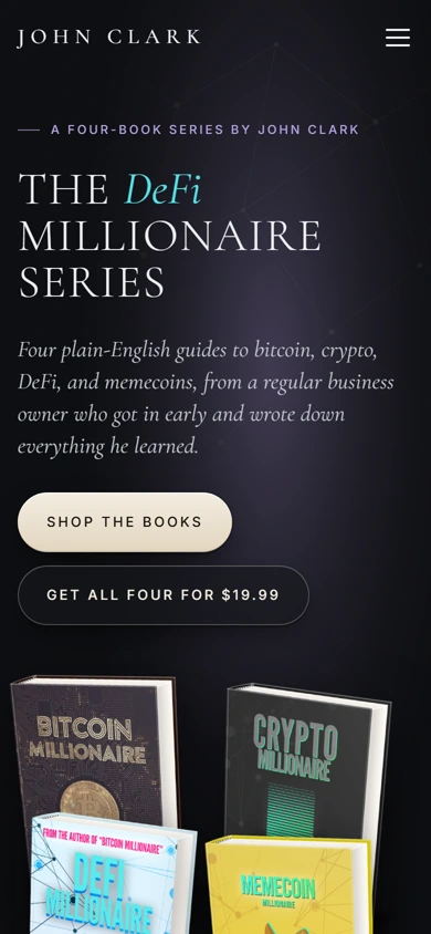
The same hero on mobile, with the book stack reflowed under the headline
johnclarkcrypto.com
The Millionaire Series hero: four book covers each with their own spine colour
The same hero on mobile, with the book stack reflowed under the headline

Three choices that carry the whole page

What makes it work.

  1. CHOICE 01

    Each book gets its own colour

    Bitcoin, Crypto, DeFi and Memecoin Millionaire each carry a distinct spine colour and accent, so four related products read as a real series with individual personalities, not four clones of one template.

  2. CHOICE 02

    Proof before the pitch, twice

    A pull-quote — “Hunter S. Thompson meets crypto” — sits above a full grid of reader reviews. Real social proof gets top billing over any “buy now” urgency copy.

  3. CHOICE 03

    The bundle is the hero offer

    The complete-series card, with the per-book price crossed out, gets its own full-width section — quietly steering toward the higher-value purchase without a single popup.

The process behind the page, start to finish

How we got there.

  1. 01

    Retained.

    John Clark brought us on to take a four-book crypto series and give it a sales page that felt like a real publisher, not an ebook funnel.

  2. 02

    Meetings.

    A handful of calls to understand the four titles, their audiences, and how the bundle should be positioned against the single-book price.

  3. 03

    Concept.

    The dark, serif-leaning register came out of this stage — a deliberate step away from typical crypto-hype landing pages.

  4. 04

    Architecture.

    Four books, one series. We mapped the page around a bookstore shelf instead of a single-product funnel.

  5. 05

    Wireframes.

    Low-fidelity layouts to test the pacing — series, proof, bundle — before any of the final visual language was applied.

  6. 06

    Finished build.

    Four spine colours, real reader reviews, and a bundle offer that does the steering without a single popup.

Your move

Want a product page this considered?