







Objectives
- Launch an odds-and-news hub that reads as a live terminal, not a leisurely blog
- Make the best price on a fight findable in seconds during fight week
- Fold news, international coverage and analysis into the same page as the odds

Case study · Website and product design
Live sportsbook odds and MMA news, run as one dense, fast-moving product for fight week.
Fast beats pretty.
Whoever is checking the line during fight week is usually refreshing for fight news too. So the odds board and the newsroom are one page.

The brief, in short
The look
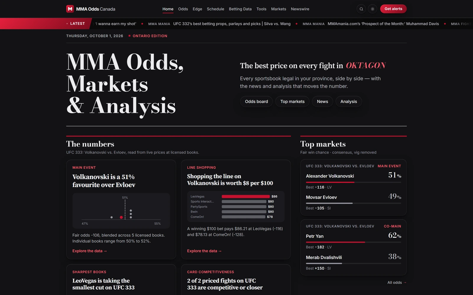
Most odds-comparison sites and most MMA news sites are separate products. This one runs both at once — a live odds board and analysis tools up top, a full news aggregator across multiple outlets and translated international coverage below — because the person checking the line the week of a card is usually also refreshing for fight news.
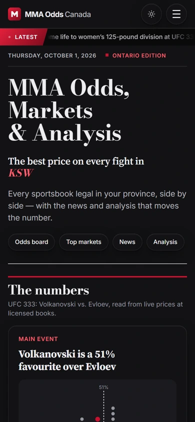
A dark, dense, red-accented layout keeps the whole thing feeling like a live terminal rather than a leisurely blog: stat cards, a full odds table and a headline grid are all visible without much scrolling, because during fight week, fast beats pretty.
The palette
A closer look
The numbers, the markets and the news, on every screen.
Three choices that carry the whole page
A live odds board sits directly above a multi-outlet news aggregator — most competitors pick one; this page treats them as the same job.
Best-price and biggest-edge callouts sit in their own stat cards above the full odds table, so a bettor gets the headline number before the dense grid.
A dedicated “world news” section pulls in Japanese and Dutch combat-sports coverage with inline translation — a small feature that signals real editorial depth, not just an odds widget with a blog bolted on.
The process behind the page, start to finish
MMA Odds Canada brought us on to merge an odds comparison tool and an MMA newsroom into one fast-moving product.
A handful of calls to understand licensed sportsbooks, line shopping and how bettors actually read an odds table.
The dark, red-accented terminal register came out of this stage — built for speed during fight week, not a leisurely read.
Odds, markets and news, one connected feed instead of two separate products bolted together.
Low-fidelity layouts to test the pacing — headline numbers, full board, news — before any of the final visual language was applied.
A dense, red-accented terminal that surfaces the best price and the latest headline in the same glance.
Pick your favorite agent — we'll open it with a question about what we do, who we're a good fit for, and how pricing works.