Case study · Website and branding

Life Between Loves.

A book launch site for Dr. T. David Rothman — built to sell the book and grow a direct readership, not just look pretty.

Let go. Heal. Love again.

Healing after divorce could easily tip into clinical self-help or greeting-card sentiment. This site does neither — warmth, a little drama, and room for the words to breathe.

The brief, in short

Project details.

Objectives

  • Launch a book site that reads as warm and editorial, not a generic sales page
  • Make the five-stage “journey” the emotional core of the page, not just a feature list
  • Sell the book everywhere it's actually available, without favouring one retailer

Key Services

  • Website design & build
  • Brand identity — wordmark, colour system, motion
  • Newsletter signup integration

Stack

  • Next.js + React
  • Tailwind CSS
  • Framer Motion
  • Vercel

The look

A quiet kind of confidence.

Healing after divorce could easily tip into clinical self-help or greeting-card sentiment. The site avoids both: deep wine reds and drifting rose petals for warmth and a little drama, paired with a restrained serif and generous whitespace that let the words breathe.

Every section builds toward the same two actions — buy the book, or join the list — without ever feeling like a funnel. The five-stage “journey” (Let Go, Heal, Rediscover, Rebuild, Love Again) gives the whole site a narrative arc instead of a table of contents.


The palette

  • Deep wine#3D060E
  • Rose red#8A0F1F
  • Warm gold#C9A05C
  • Cream paper#E3D8CB

A closer look

Inside the site.

The same warmth and drama, on every screen.

01 / 03
lifebetweenloves.com
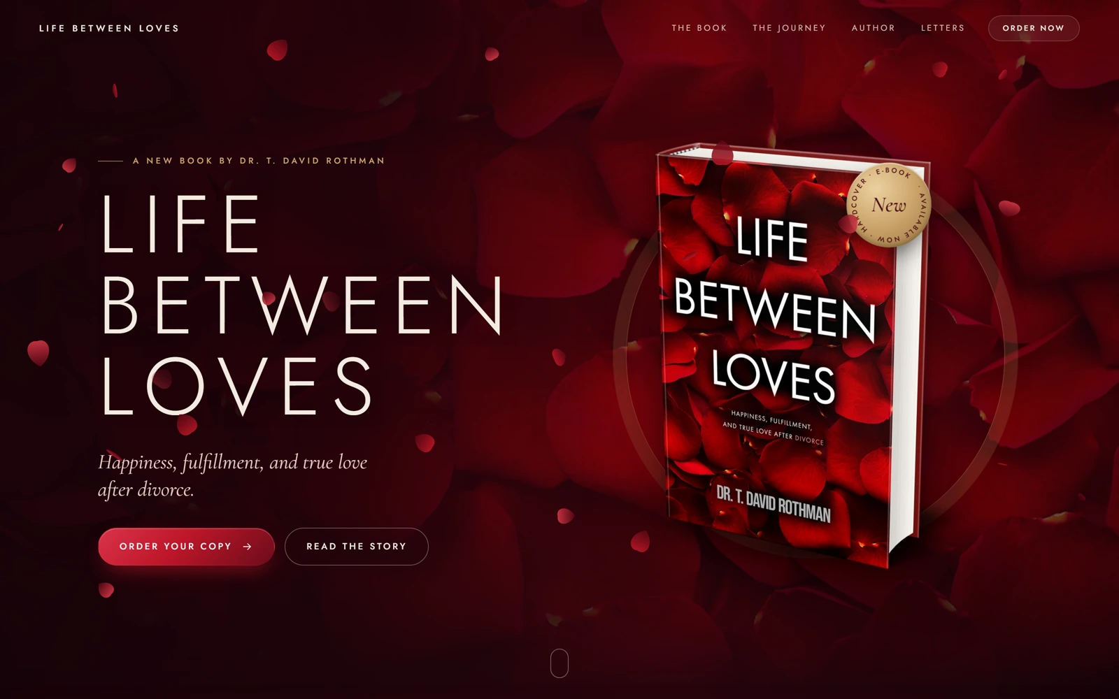
Life Between Loves' hero: the book cover set against a bed of rose petals, with the Order Your Copy button
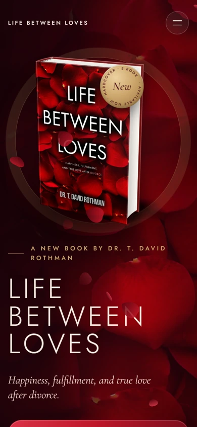
The same hero on mobile, book cover stacked above the title
lifebetweenloves.com
Life Between Loves' hero: the book cover set against a bed of rose petals, with the Order Your Copy button
The same hero on mobile, book cover stacked above the title

Three choices that carry the whole page

What makes it work.

  1. CHOICE 01

    A wordmark that reads like a book jacket

    Spaced-out serif caps over a soft rose backdrop feel more like literary cover type than a landing page — exactly right for a memoir-adjacent title in a crowded genre.

  2. CHOICE 02

    A journey, not a table of contents

    “Let Go, Heal, Rediscover, Rebuild, Love Again” turns what could've been a plain outline into the same emotional arc as the book itself.

  3. CHOICE 03

    Retailer-agnostic, always

    The buy flow never assumes Amazon — six real options sit side by side, because a reader picking up a book like this doesn't want to feel upsold.

The process behind the page, start to finish

How we got there.

  1. 01

    Retained.

    Dr. Rothman brought us on to give Life Between Loves a launch site that felt as considered as the book itself.

  2. 02

    Meetings.

    A few calls to understand the book's five-stage structure and how directly the page could speak to something this personal.

  3. 03

    Concept.

    The rose-petal hero and wine-red palette came out of this stage — warmth and a little drama, without tipping into clinical or saccharine.

  4. 04

    Architecture.

    Buy the book or join the list — every section on the page builds toward one of those two actions, in that order.

  5. 05

    Wireframes.

    Low-fidelity layouts to test the pacing of the five-stage journey before any of the final visual language was applied.

  6. 06

    Finished build.

    A warm, editorial site that reads like a book jacket, not a funnel — six retailers away from a sale on every screen.

Your move

Want a launch site this considered?