Case study · Website

Minton Contractors.

A civil contractor site built to prove the crew shows up and the site stays safe — not to win a design award.

We move the ground.

Heavy equipment, one confident orange, and headlines written the way a site manager actually talks. A crew that’s good at the work, and wants you to believe it fast.

The site

The brief, in short

Project details.

Objectives

  • Launch a civil-contractor site that proves the crew shows up, not a design award entry
  • Show the work before explaining it — real jobsite photography over service bullet points
  • Compress the entire sales process into as few plain-language steps as possible

Key Services

  • Website design & build
  • Brand & content direction — palette, photography direction, copy
  • Quote-request integration

Stack

  • Webflow
  • Photoshop
  • CSS
  • JavaScript

The look

Built like a jobsite, not a portfolio.

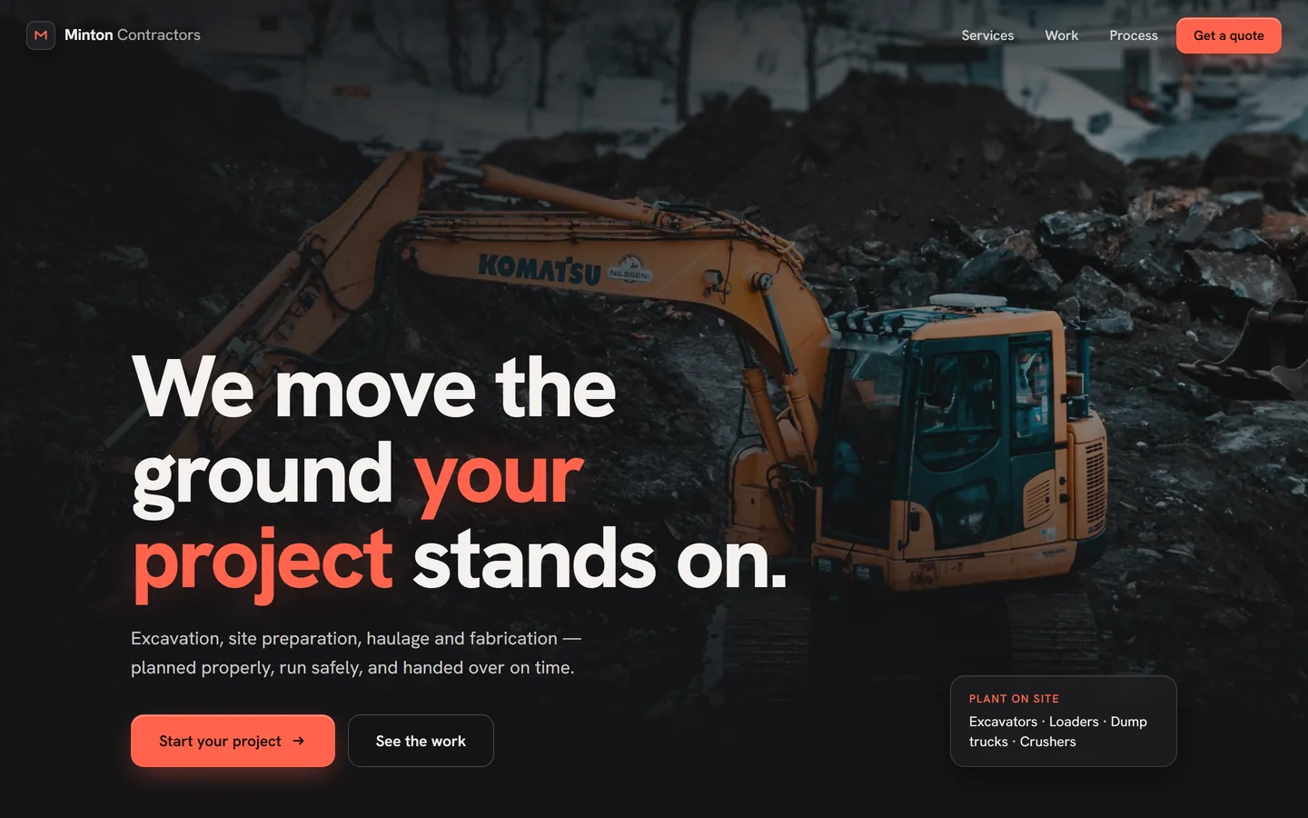
Heavy equipment on a dark, high-contrast background, one confident orange accent, and headlines written the way a site manager actually talks — “We move the ground your project stands on.” It reads like a crew that’s good at the work and wants you to believe it fast.

A diagonal caution-tape banner cutting across the page — SAFETY FIRST · BUILT TO LAST · ON TIME, ON BUDGET — is the one purely decorative flourish, and it’s on-brand rather than gimmicky: this is a company whose actual jobsites are covered in tape just like it.


The palette

  • Site orange#FF644C
  • Site black#141416
  • Sky grey#CDD7E1
  • Callout white#FFFFFF

A closer look

Inside the site.

The crew, the equipment, the headline.

01 / 03
mintoncontractors.ca
Minton Contractors' hero: an excavator on a jobsite behind the We move the ground your project stands on headline
mintoncontractors.ca
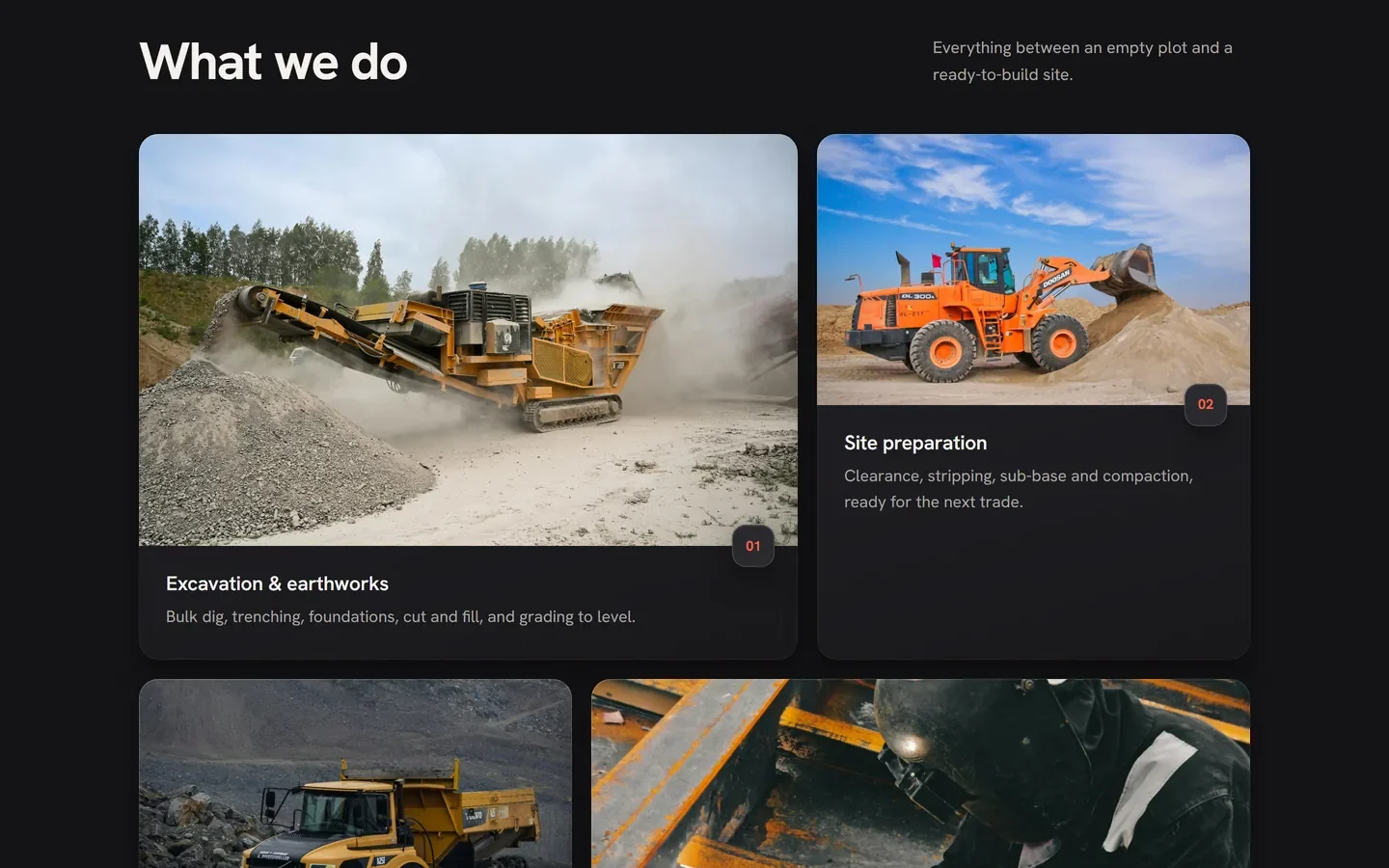
What we do: excavation, site preparation, haulage and fabrication as real jobsite photos
mintoncontractors.ca
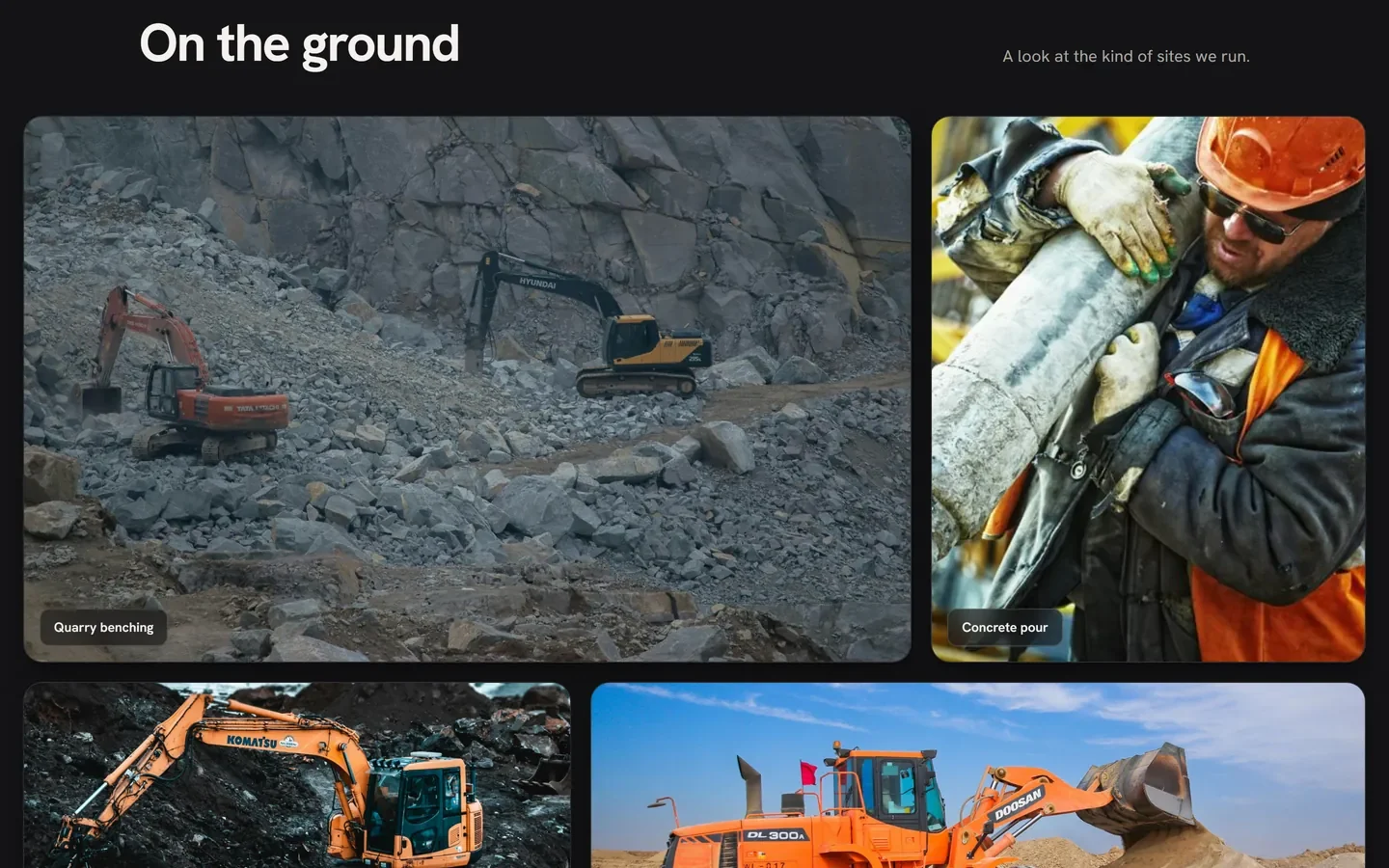
On the ground: a gallery of quarry benching, concrete pours and foundation digs

Three choices that carry the whole page

What makes it work.

  1. CHOICE 01

    A photo grid instead of a service list

    Excavation, site prep, haulage and fabrication are shown as four real jobsite photos in a 2×2 grid, not four bullet points — you see the work before you read a word about it.

  2. CHOICE 02

    The caution tape does double duty

    A scrolling diagonal tape banner breaks up the page visually and reinforces the safety-first message, without needing its own section or subheading.

  3. CHOICE 03

    Three steps, no jargon

    “Site visit, clear quote, build & hand over” compresses an entire sales process into three plain-language steps — exactly as much explanation as a busy GC actually wants.

The process behind the page, start to finish

How we got there.

  1. 01

    Retained.

    Minton Contractors brought us on to build a site that proved the crew shows up, not one that chased a design award.

  2. 02

    Meetings.

    A few calls to understand the services, the jobsite photography on hand, and how a site manager actually talks to a client.

  3. 03

    Concept.

    The dark, high-contrast register and the caution-tape motif came out of this stage — on-brand for jobsites that are actually covered in tape.

  4. 04

    Architecture.

    Show the work, explain the process, make the ask — a straight line instead of a portfolio-style wander.

  5. 05

    Wireframes.

    Low-fidelity layouts to test the pacing — hero, photo grid, process, quote — before any of the final visual language was applied.

  6. 06

    Finished build.

    Real jobsite photography, one confident orange accent, and a sales process compressed into three plain-language steps.

Your move

Want a trade site this direct?