




Objectives
- Launch a coaching site that feels like a relationship, not a clinical program
- Make an abstract, often-scary process feel like it visibly has a shape and an end
- Ground a remote service in real places, not a generic city-select dropdown

Case study · Website, branding, local pages
One-on-one sobriety coaching, presented with warmth instead of clinical distance.
Warm, not clinical.
Recovery sites tend to feel clinical or falsely upbeat. Sober Coach takes a third path: warm, personal, and built around a relationship, not a program.

The brief, in short
The look
Recovery sites often default to either clinical and sterile or falsely upbeat. This one takes a third path: a dark, warm background with ornate, colourful floral and dragon artwork drifting through it — decoration that feels personal and considered, for a service that’s fundamentally about a relationship, not a program.
The centrepiece is a vertical timeline — free consult, share your goals, choose your coach, work together, reach your goals, maintenance — connected by a single glowing line with a small icon at each stop. It turns an abstract, often-scary process into something that visibly has a shape and an end.
The palette
A closer look
The same warmth, on every screen.
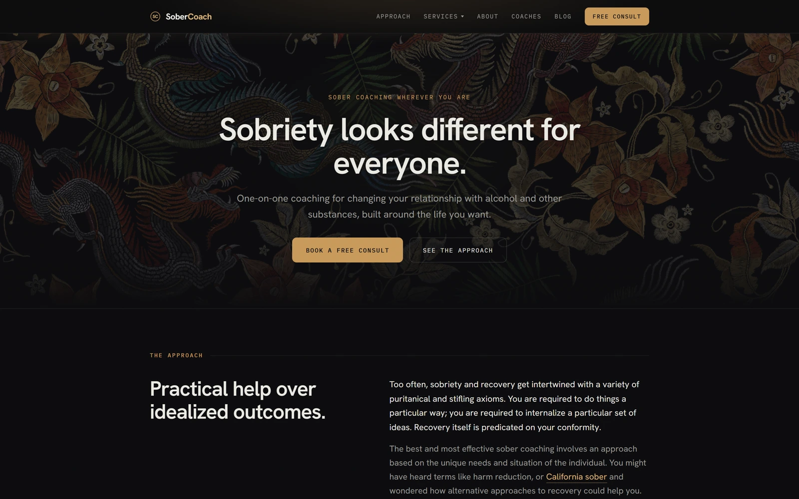
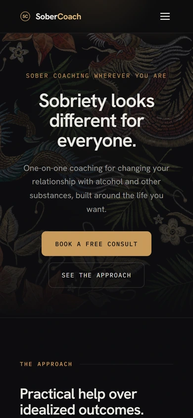
Three choices that carry the whole page
Six steps are drawn as a single connected vertical journey with circular icons, not a numbered list — with an explicit note that steps can repeat, because recovery isn’t linear.
Ornate floral and dragon illustration recurs as ambient decoration behind the hero and along the timeline — a distinctive visual signature no generic wellness template would ship with.
Toronto, Vancouver and Miami are shown as real photographed skylines in a card row rather than a plain city-select dropdown, making a remote coaching service feel grounded in actual places.
The process behind the page, start to finish
Sober Coach brought us on to take one-on-one recovery coaching and make the first screen feel like a relationship, not a program.
A few calls to understand the coaching journey and why it needed to read as non-linear, not a straight line to a finish.
The ornate floral and dragon artwork came out of this stage — a warm, personal register in place of clinical or falsely upbeat.
Free consult through maintenance, one connected timeline instead of a list of services to pick from.
Low-fidelity layouts to test the pacing — hero, timeline, locations — before any of the final visual language was applied.
A glowing single-line timeline, real artwork, and real cities that make a remote service feel personal.
Pick your favorite agent — we'll open it with a question about what we do, who we're a good fit for, and how pricing works.